This company wanted a logo that was simple, could be easily recognized, be placed on letterhead and beer caps alike...and had to incorporate the state of Indiana. Not a small task, but our design team, through several variations, found the perfect logo that this thriving brewery was looking for.

Simple. Elegant. Poetic? Maybe. Definately striking and engaging with the public that consume this bold wine. The enlarged "V" makes this two toned logo pop right off whatever it is printed on.
Wine glass or stork? You be the judge. A lable as enigmatic as the wine they produce. Simple and effective and extremely well received by the clients.
A variation for the company logo design we were doing. It didn't work for the client as a logo, but they loved the design and have plans to implement it elsewhere in their merchandising and sales department.
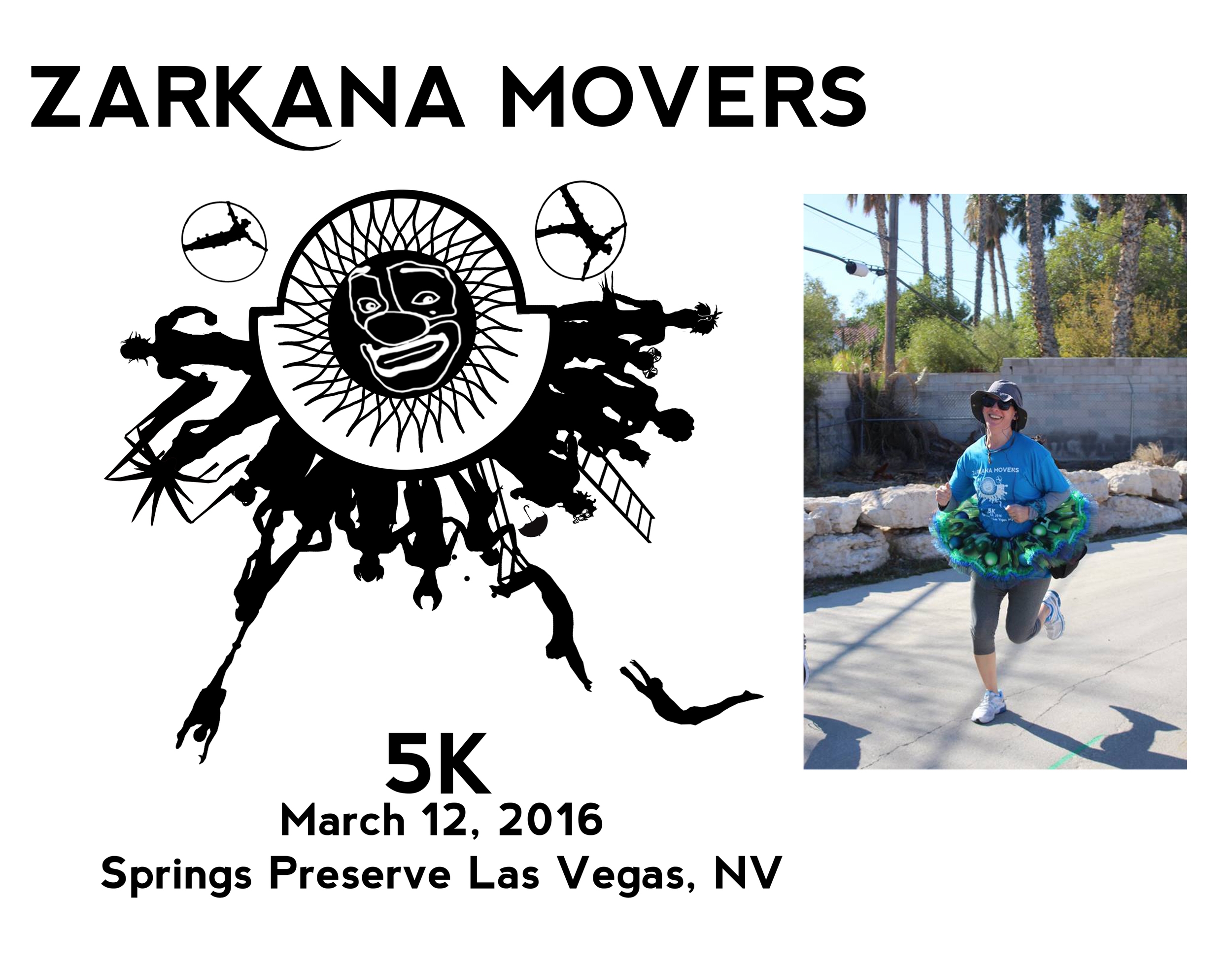
The logo, a playful take on the Cirque du Soleil sun logo, was a hit with the runners of this great charity event


This company wanted a logo that was simple, could be easily recognized, be placed on letterhead and beer caps alike...and had to incorporate the state of Indiana. Not a small task, but our design team, through several variations, found the perfect logo that this thriving brewery was looking for.
Simple. Elegant. Poetic? Maybe. Definately striking and engaging with the public that consume this bold wine. The enlarged "V" makes this two toned logo pop right off whatever it is printed on.
Wine glass or stork? You be the judge. A lable as enigmatic as the wine they produce. Simple and effective and extremely well received by the clients.
A variation for the company logo design we were doing. It didn't work for the client as a logo, but they loved the design and have plans to implement it elsewhere in their merchandising and sales department.
The logo, a playful take on the Cirque du Soleil sun logo, was a hit with the runners of this great charity event
